


The FilmLight Colour Awards draw attention to the artistry and technical precision of colourists who bring the magic of colour to projects from independent features to stylish commercials
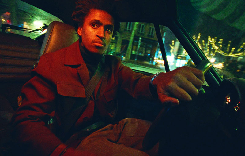
Music Video 'Brodka x Igo, Myślę sobie Ż', graded by Nadia Khairat Gomez
The FilmLight Colour Awards draw attention to the artistry and technical precision of colourists around the world who bring the magic of colour to projects from independent feature films to high-fashion commercials
FilmLight, in their fifth year, is now inviting colourists of all levels to share their vision and gain recognition from respected voices in the industry by applying for the 2025 FilmLight Colour Awards. At last year’s 2024 event, each winning project reflected a distinctive approach to colour that took advantage of the power of visual storytelling. In this article, the company takes a close look at the winning colourists’ creative journeys on their work.
Theatrical Feature – Greg Fisher
The award for the grading of a theatrical feature went to Greg Fisher at Company 3 in London for his work on Poor Things.
As a period film, though fantastical and exaggerated, Greg felt it was important for it to feel grounded in reality. As he worked with director Yorgos Lanthimos and DoP Robbie Ryan, he aimed for a palette that was faithful to the design, and expressive enough to handle the more extreme moments, while also maintaining an emotional connection to the characters.
“I love Poor Things,” he said. “It’s an example of why I love film, where all elements pull together - the acting, script, production design, costume design, music, cinematography, editing and, of course, direction. The story and tone are a unique blend of frightening, funny, outrageous and heartfelt and I hope all aspects of the look help to convey this.”
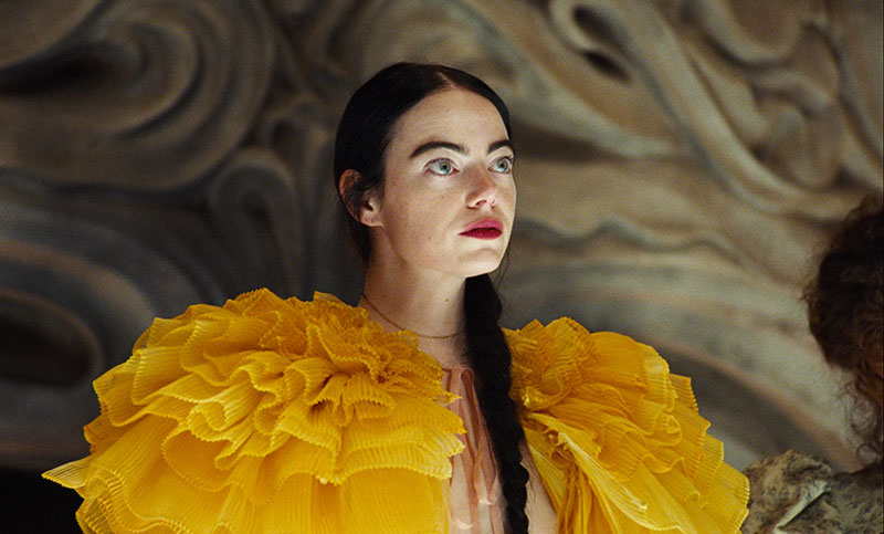
The film was shot on colour, black and white negative plus Ektachrome colour reversal. “Bella’s infancy and childhood are shot in black and white, and then it switches to colour as she becomes an adult,” said Greg. “Yorgos and Robbie decided on this approach during the shoot – such an effective way to define that line. They are both wonderful artists and very knowledgeable about every aspect of how to create an image.”
All of them worked together on ways to bring the most out of the imagery in the grade. “Sometimes we pushed things, then fed some of those ideas back to VFX to incorporate in a more extreme way,” Greg said. “Sometimes pushing particular moments or quietening down others to allow key scenes to feel stronger. The grade itself is just one part of that overall look.
“The visuals are pretty unique. I'm not aware of anything out there that looks very much like this film. I suppose the seed might be in Alasdair Gray’s illustrations and paintings.”
Television Series/Episodic – Manuel Portschy
Freelance colourist Manuel Portschy in Berlin received the award for grading a TV series / episodic for his work on The Zweiflers, season 1. The series is the story of a Jewish family running a delicatessen empire in Frankfurt, Germany. When family patriarch Symcha Zweifler decides to sell it, while his grandson is expecting a baby, the family dynamics get tense.
“We tried to incorporate some of this heightened tension throughout the episodes and developed a show look that did most of the heavy lifting in terms of colour palette, contrast and texture – while keeping it flexible enough for us to take many different directions with the underlying colour palette,” Manuel said.
“With what we liked to call our ‘neutral palette’, we decided to specifically manipulate neutrals all over the luminance range during grading. This meant whenever we saw a supposedly neutral area in the frame, like white walls, dull skies, grey tiles and concrete, we would make use of our modifier to push some colour into it.”
He commented that the project was a dream for him to work on creatively. “The DoP Phillip Kaminiak had so much trust from his two directors, showrunner and producers, that we basically graded by ourselves with occasional rounds of approval in between episodes, to discuss the progress of the look of the show,” he said.
“This award is a collaborative achievement – a dream come true – for the whole team, especially Phillip, my friend as well as our DoP. He did an outstanding job shooting in a way that gave us so much flexibility to play around with in the grade.”
Commercial – Tim Masick
The award for the grading of a commercial went to Tim Masick at Company 3 in New York for his work on Zara, SS24 STUDIO COLLECTION.
The spot was directed by Fabien Baron and shot by DoP Philippe LeSourd. Tim said, “For me, this project stands out as an example of using colour to support the mood of the film without overstepping the light that Philippe created.
“Since Fabien and I have a very longstanding relationship, I created the base colour treatment beforehand and then presented it to him and the art director, Jieun, while working remotely. From there we experimented with changing the colour of various elements in each set – the floor, chairs, walls, curtains and so on – to find combinations that worked well internally, as well as relative to the other scenes. Once we made a version we liked, we came back the following day, made some subtle changes and called it done.
“With most of Fabien’s work, there is beauty, subtlety and tension,” said Tim. “Each of these need to be acknowledged and executed at a high level. For this project, there is a sense of rarefied beauty, controlled calm and hypnotic precision with an undercurrent of mystery to offset the surface beauty.
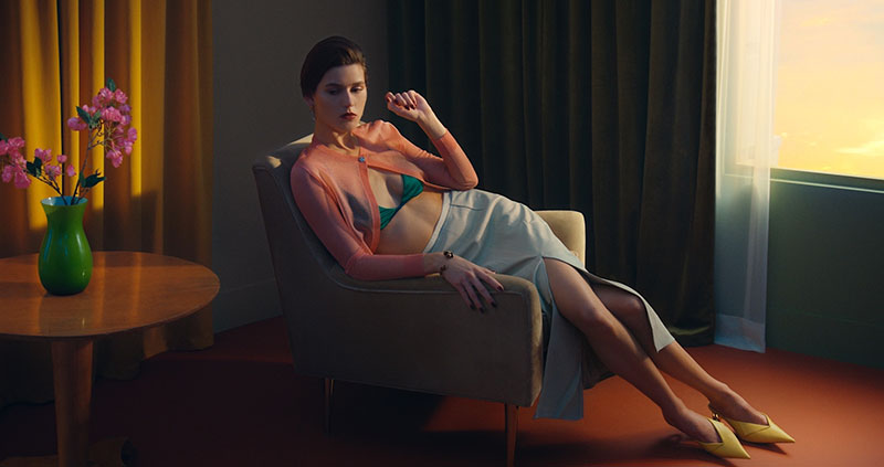
“There were no visual references for this, but the light was beautiful and very intentional. Ideas for the colour treatment were fairly wide open, so I made a playlist based on the mood I felt it should have. It featured a lot of classic Japanese female vocalists like Taeko Onuki, a bunch of leftfield 70s and 80s deep cuts, and some Durutti Column albums I hadn’t listened to previously. All of this melded together to get me into a zone to define the look of the film.”
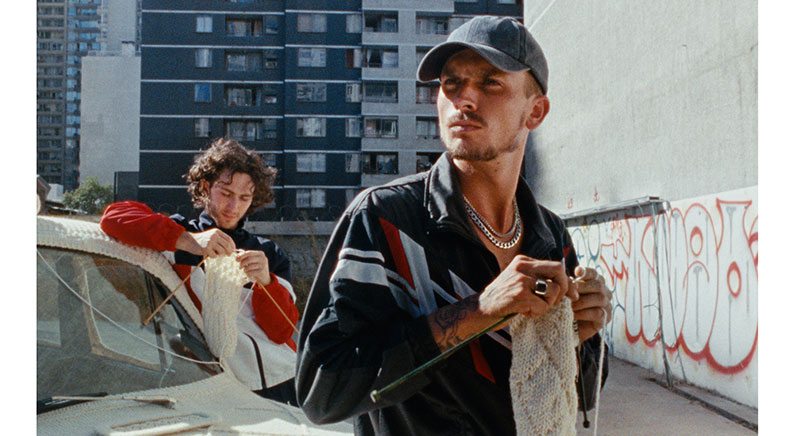
Music Video – Nadia Khairat Gomez
Freelance colourist Nadia Khairat Gomez, who works between Berlin and Madrid, won the award for the grading of a music video for her work on Brodka x Igo, Myślę sobie Ż.
She noted that she had wanted to enter an unconventional project that would be very different from any commercial work she had done before. “The creativity of this project and the vision of the director had allowed me to experiment,” she said. “I was also captivated by the tone of the video— it's simple yet friendly and quite hypnotic. It’s the kind of project I’m eager to bring to a larger audience.
“For me, what makes this film truly special is how it instantly evokes the charm of those amazing summer postcards from the past, which our grandparents used to share with relatives to showcase the sunny places they visited,” said Nadia.
“The project was shot on 16mm film, and we wanted to reinforce its analogue style and look. We aimed for a soft, bright and joyful look that aligns with the mood of the song. We wanted to keep it realistic, with neutral tones in the skin while avoiding extremely dark tones in the shadows.
“I also find the VFX work fascinating and playful. For instance, there's a whimsical floating crochet car that contrasts beautifully with the realistic look and feel. This adds a surreal layer of fun and surprise to the project, which I find truly mesmerising.”
Pleased to be recognised for a fun, independent project like this one, she said, “People sometimes think you need a big production and budget to gain visibility, but independent projects often give creative freedom to everyone involved, which was the case here.”
Emerging Talent – Douglas Dutton
The Emerging Talent award, open to colourists aged 18-35 for commercial or music video projects, went to freelance colourist Douglas Dutton in Paris for his work on a brand film for Baltic watches, Harmonical Diffraction. “I really connected with the timeless aspect of this piece, and the jazzy Parisian night vibes,” Douglas said. “The creative team really pushed it hard and wanted to make a statement. It’s the kind of project I love to work on.
“The look of the project is a gritty 16mm film emulation, designed from scratch. The original material was shot on digital SLR cameras with a sharp modern lens – not the easiest starting point for that sort of challenge.
“I’ve worked with this team for a while and we trust each other personally and creatively, so I had total creative freedom to ‘make it look interesting’. Usually this creative team leans towards filmy aesthetics, and I thought it would be right to push a 16mm look and have fun designing it.”
Noting that the Baltic brand is about classic aesthetics heritage, with mechanisms that are automatic, he said, “I think the analogue and classic film aesthetic was perfect to emphasise the Parisian night mood paired with the classical identity of the product.”
Spotlight – Raúl Lavado Verdú
The Spotlight award recognises colourists who have worked on a film with a budget under $3 million US. The 2024 award went to Raúl Lavado Verdú at Misterio Color Lab in Madrid for his work on La Espera (The Wait), a horror thriller feature by F. Javier Gutiérrez
Raul said, “I felt the work we did on the colour grading captured the emotional essence of this film. The story is full of subtleties, and the use of colour was key to emphasising that quiet tension. I wanted others to see how the right use of colour can amplify the atmosphere of a film.
“The look is minimalist, but full of nuances. We opted for a muted colour palette that reflects the emotional isolation of the characters. What is distinctive about this project is how the colour accompanies the narrative in an almost imperceptible way, maintaining the tension but without stealing the spotlight from the story or the performances.
“It is a look of strong contrast. Due to the loneliness and aridity of the Andalusian lands, it had to be ‘smellable’ and suffocating for the viewer. There is a key point in the film, where we ‘kill’ all the green colours, which signifies hope. The film is full of small nuances like this,” said Raúl.
“The grading helped reinforce the sense of emptiness that dominates the film. We played with deep shadows and dim lighting to make the viewer feel that sense of endless waiting that affects the characters. The use of strong contrasts and heavy grain creates an oppressive atmosphere, which reinforces the melancholic tone of the story.”
“On this project, I worked alongside the director and DoP, who had a very clear vision about the atmosphere they wanted to create. I had a lot of freedom and my proposals were always well received. Thank you, Miguel Mora and Javier Gutiérrez, for your trust.”
Colourists Around the World
Colourists can submit projects across these same six categories – Theatrical Feature, Television Series/Episodic (including documentary/non-fiction), Commercial, Music Video, Emerging Talent and Spotlight.
Whether the work comes from a big-budget production or a personal passion project, the FilmLight Colour Awards recognise the use of colour to tell a story. Entries close on 7 August and are open to colourists working on any grading system and are independently evaluated by a panel of cinematographers, fellow colourists and media experts. www.filmlightcolourawards.com


